Screen Color Vs. Print Color
Why Do My Printed Images Sometimes Look So Bad?
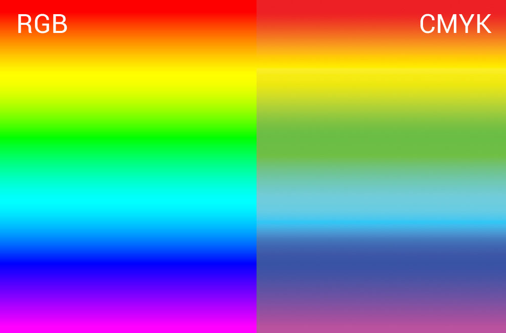
If you’ve ever handled the graphic design or photography for a printed piece, you might have been disappointed in the way your beautifully rich and vibrant images appear dull and generally crummy in print. If you’ve wondered why that happens, it’s likely due to the color conversion process. Printed images are created with an entirely different color system than is used on screens. Digital cameras capture images in RGB color, and screens display images with RGB color, but most commercially printed images use CMYK color, which has much fewer, and less bright colors than RGB.
What happens to all the color?
Before your RGB image can be printed, it is converted into a CMYK image. As you can see from the graphic above, some of the colors in the RGB color spectrum look awful when converted into CMYK. Unfortunately, there is no way to duplicate many of the colors that you can see on screen when using CMYK printing. Those colors are considered “out of gamut” and the program that converts the rgb image into a CMYK image makes it’s best guess about how to convert the color. If you leave it all up to the computer, or just let the printer deal with your RGB images, you might end up with disappointing color that looks nothing like what you expected.
How to Fix It
For the best result with print images, be sure to do your final color work in CMYK and set up a reliable proofing method for your print images. You can use Photoshop to convert and edit photos in CMYK – or or – even easier – call your local cmyk color expert (that’s me!) for graphic design help – 843-271-1392.
Geeking Out On this Topic…
I have just scratched the surface of color systems, and if you find this topic to be fascinating (like me!) there’s lots more good info here.